Top Ten Cover Trends I Love (or Hate)
This one was hard for me because, while I absolutely LOVE some covers (and hate others), it's hard for me to always really quantify why. Still, when I took a look, I was definitely able to come up with some patterns. Not sure if these are really trends or not, but this is what I'm going with. I couldn't quite come up with ten either.
I LOVE:
Rich Colors


Color is probably one of the most influential factors in whether or not I truly love a cover. In fact, you'll find that lots of my favorite covers that fall into other categories below also have vibrant colors!
Tactile Covers


Fun Typography


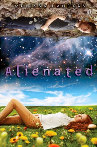
Stars

Pretty Dresses
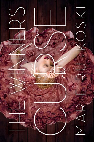

Yep! I know lots of people hate them (or are sick of them), but I'm kind of a sucker for a pretty dress - as long as it goes with the story!
Fantastical Settings


Just look at these amazingly awesome places! Don't you want to go there? (At least just for a minute!)
I HATE:
(Or at least don't love)
Minimalism


Symbols


Cartoons


Bad Self-Published Covers
I'm not going to put any pictures here because it just seems mean, but there are some really cheesy covers out there that scream "self-published author who doesn't have access to a good cover designer!" I sometimes still give these books a chance, but it is a big strike against the book!
Oh, and one more thing ...
I really hate it when the cover doesn't match the book. I don't mind people on my covers, but they'd better match the description of the character in the book, or I'm downright aggravated. A cover that has seemingly nothing to do with the book? Hate it! (Although I heard a funny story recently about how most authors have absolutely no control over their covers and how one author actually had to add a random apple picking scene into her book because her publishers insisted on using a cover with an eighteen year old girl holding apples even though the book was about a much older woman - and there were no apples originally involved. Craziness!!)
So, what do you think? Do you agree with me? Totally disagree? I want to know!